
Truth. Told Boldly.
Truth. Told Boldly.
A peek behind the curtain at The Guardian. This is how we took strict heritage brand guidelines and pushed them a little further with dynamic motion design.
- Role
- Motion · Art Direction
- Scope
- Campaigns · OOH · Social
- Output
- ↗ CTR across sub-brands
Journalism is serious, but the design doesn't have to be. While working within the OLIVER × Guardian marketing team, we set out to shape a fluid motion language and art direction that works across all of The Guardian's sub-brands. Here is a look at some of my favourite standout work.
Dancing
type.
We wanted to introduce something new to The Guardian's visual identity: typography that actually moves. We took that idea and built it out into a full OOH and social system. It's bold and recognisably The Guardian, but with a playful pulse the brand doesn't usually get to experiment with. The posters took over central London while the social assets brought that exact same energy to your phone feed.


 16:9 · OOH
 9:16 · Street panel
 Wheatpaste
Making stuff people actually stop to look at.
Not for
sale.
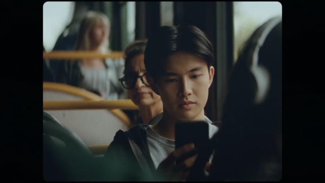
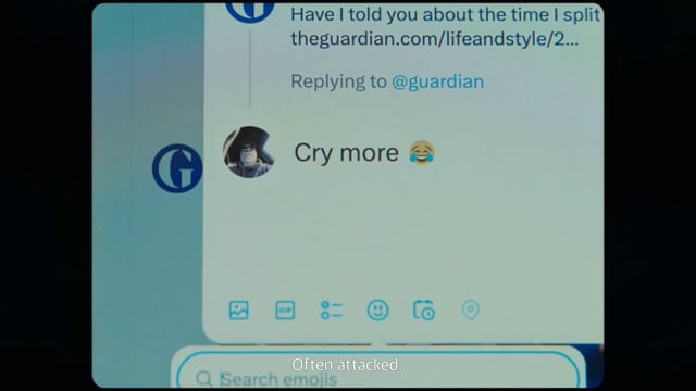
A campaign in collaboration with Lucky Generals built around The Guardian's editorial independence. No bribes, no gambling sponsors, no funds tied to environmental damage. The brief was set by Oliver and The Guardian marketing team. Due to internal capacity, we conceptualised the campaign and handed production over to Lucky Generals.
Back inside our team, the focus shifted to cutdowns. Turning 60-second hero films into 15-second spots while keeping the message punchy and the tone consistent.
Guardian ×
Glastonbury.
How do you bring The Guardian's editorial brain into a chaotic music festival? You build social and digital assets that hold their own against the noise, without leaning on The Guardian's traditional branding as a crutch. We focused on making the work feel alive online, blending festival energy with sharp motion design.


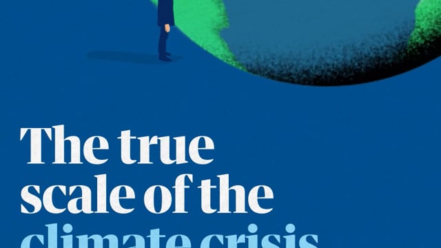
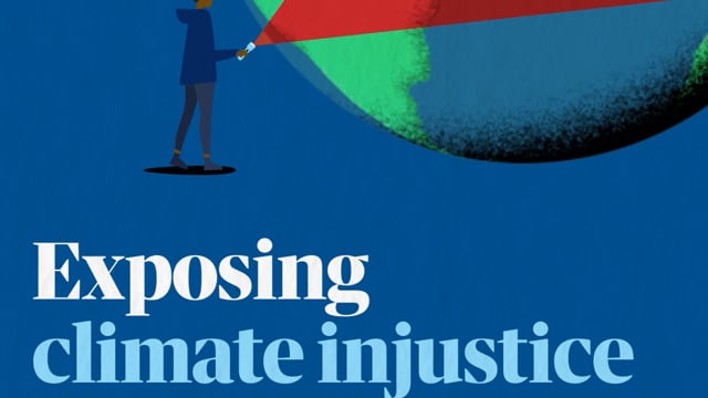
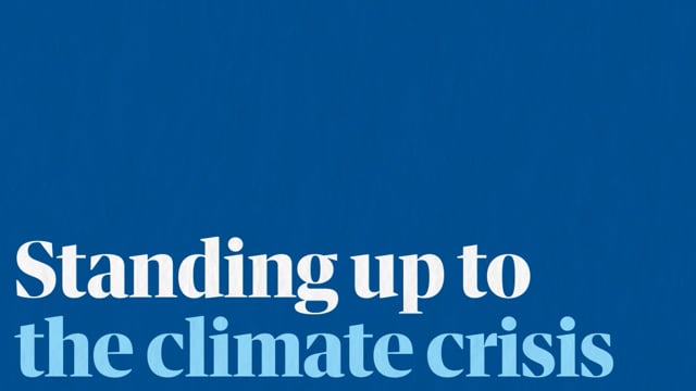
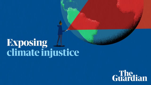
Climate
moments.
A short series built around The Guardian's investigative climate reporting. I led storyboarding and animated assets, working alongside the design director to keep visuals striking and faithful to the story the journalism was telling.
Format flexibility was baked in from the design phase. Every frame was designed knowing it would be resized to 16:9, 1:1 and 9:16 formats. Designing for re-cut from the start gave each format the same impact as the original.
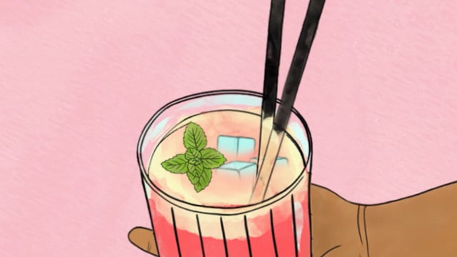
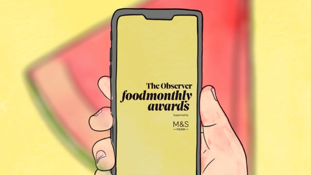
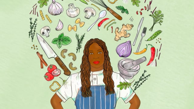
Observer
food awards.
Social campaigns for Observer Food Monthly. Taking the Guardian's vibrant illustrative voice and letting it cook. Visuals appetising enough to stop a scroll, then convincing enough to convert it into a vote.
Shaping
the Guardian.
Whether we were creating Podcast graphics, Guardian Jobs, or Guardian Weekly, the brief was the same: bring life to the The Guardians artwork. We stayed loyal to the brand's colours and typography, which meant we could totally push the boundaries of the motion itself. It just goes to show how much fun you can have inside a strict design system.


